Illustration & Graphic Design
Tea Bean Co
Hot or Iced Tea with Benefits

Objective
This project was a design exercise for a potential job opportunity. I was tasked with creating charming packaging for a tea brand. I developed the brand's logo and established the overall aesthetic for the packaging. Utilizing illustration tools, I crafted meaningful designs that reflect the essence of the fictional tea brand.
Services
Illustration
Graphic Design
3D Rendering
Starting Off With Simple Illustrations
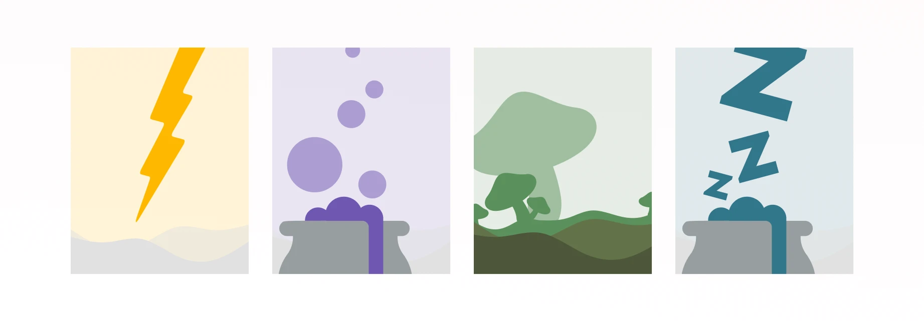
I began the project with the given packaging dimensions, which guided my design process. I considered the appropriate color schemes and themes for each type of tea. For an energy-boosting tea, I chose a lightning bolt symbol. For a sleep aid tea, I illustrated a cauldron with three Z's emerging from it. For a lion's mane mushroom blend, I envisioned green fields. The goal was to create images with multiple meanings that would capture the viewer's attention. I achieved this with a simple, monochromatic color scheme that left ample space for text and other elements, suitable for packaging purposes.

This image showcases the final renderings of the icons presented to the client.
Creating Iconic Icons
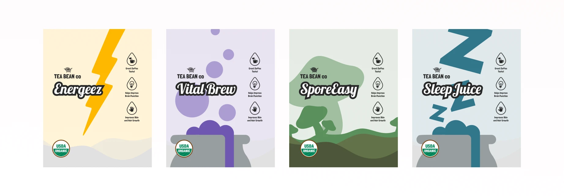
It all started with an idea. The brand name was Tea Bean Co., and I envisioned a cute mascot in the shape of a tea bean. I decided to use icons that represented tea and water, incorporating them inside droplets to hint at flavor and taste. This approach gave birth to the overall design concept. For the font, I selected Lobster with a black stroke and white text, as I felt it was fitting. This is how the design came to life.
Putting It All Together
The process was straightforward. I simply added the name of each combination alongside the logo I created and incorporated the iconography. It was a simple and sweet process, easily repeatable. While the layout was similar to other tea brands, I believe this packaging design stands out as a fresh and unique brand. I was very happy with the final result!

Done and Rendered In 3D
This project allowed me to see how the material would look when fully rendered in 3D. The colors really popped and gave each product its own distinct flavor, yet they clearly belonged to the same brand, Tea Bean Co. I aimed for a simple and clean design. The packaging material used was Glossy Stand-Up Barrier Pouches, and I believe the 3D rendering effectively highlights this material, making the package shine!

Takeaway
In this project, I learned a great deal about creating illustrations and how simple shapes can transform into something impactful. I also discovered the importance of packaging dimensions and how they affect the overall look. Proper placement of elements is crucial; otherwise, things can appear off. Additionally, I learned that the type of packaging material matters significantly. A paper material would look very different from a plastic material, and this difference impacts the design.