Graphic Design & Print
SNAP Brochure
Supplemental Nutrition Assistance Program

Objective
Government benefit materials, like the SNAP eligibility brochure, rarely receive visual updates—likely because resources are allocated elsewhere. However, I saw an opportunity to improve this. Why not give it a fresh, cohesive design that’s both visually appealing and easy to understand? I took on the challenge of redesigning the brochure to ensure it clearly communicates all the necessary information while incorporating a modern, approachable aesthetic. By adding the SNAP logo and organizing the content in a clean, intuitive layout, I aimed to make the brochure more engaging and user-friendly. This project was about more than just aesthetics; it was about creating a design that empowers people to access the resources they need.
Services
Graphic Design
Print
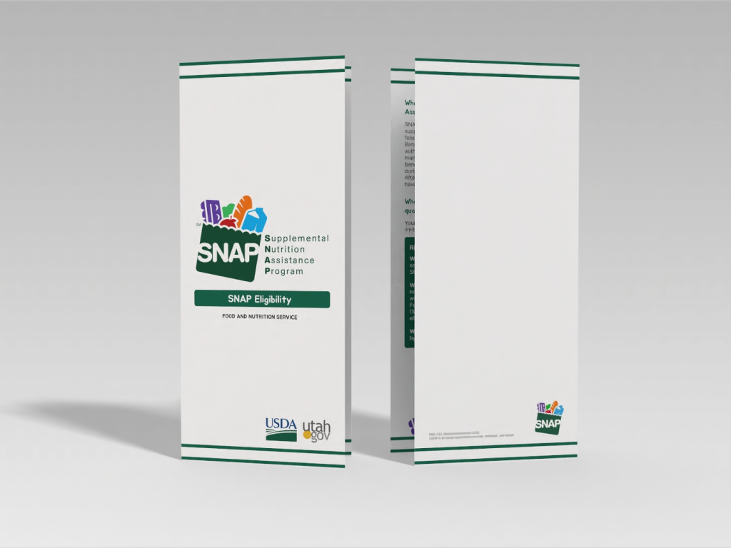
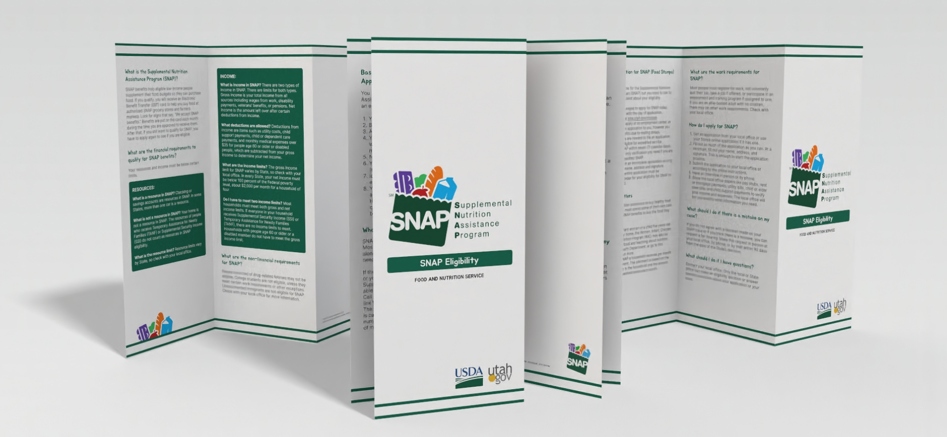
This image displays the final product published and printed.
The Design & Fold
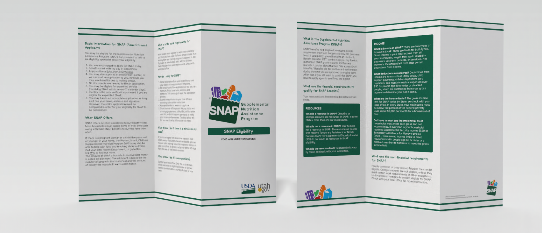
While the principles of layout and composition might seem straightforward. I quickly realized that every detail—from the hierarchy of information on the front and back covers to the alignment of margins and bleeds—plays a critical role in the final product.
One of the most valuable lessons I learned was the importance of preparing print-ready graphics. Ensuring that every element was meticulously aligned and formatted not only guarantees a professional result but also prevents costly errors during mass production. This attention to detail became a cornerstone of my design process, and it’s a skill I now carry into every project. Through this experience, I gained a deeper appreciation for the intersection of design and functionality, and I’m excited to apply these lessons to future challenges.
Simplifying Information: A Clear and Visual Approach
My goal was to present the information in a simple, digestible way. I broke down the content into clear sections, using bold, colorful titles to highlight key topics and placing the corresponding details below. All the information was sourced directly from official SNAP documents, but I reorganized and condensed it into one cohesive brochure that covers the essentials.
I paid close attention to layout details, ensuring the margins and spacing created a logical hierarchy of information. This makes it easy for the eye to follow and helps users quickly find what they need. By grouping related content into visually distinct blocks, I maintained clarity without sacrificing the design’s appeal. The result is a brochure that’s not only functional but also visually engaging—keeping the information accessible and interesting.
Precision in Spacing and Layout
For this brochure, consistency was key. The sides, top, and bottom margins were carefully designed to create a balanced and cohesive layout. Specifically, I used 24px margins at the top and bottom to frame the content and give it a clean, professional feel. To ensure clarity and readability, I implemented a systematic approach to spacing:
7px spacing was applied to group related elements, maintaining a visual connection between them.
16px spacing was used to separate distinct sections, creating clear boundaries and making the information easier to navigate.
These deliberate choices are evident in the detailed spacing rulers and grids I incorporated into the design. This level of precision not only enhances the brochure’s professionalism but also ensures that every element feels intentional and well-organized. It’s a testament to how thoughtful spacing can elevate the overall user experience.
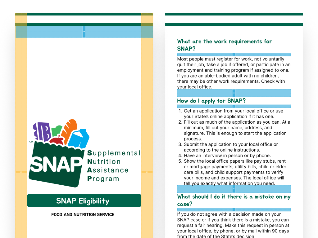
This image illustrates the margins and spacing applied throughout the project.
Takeaway
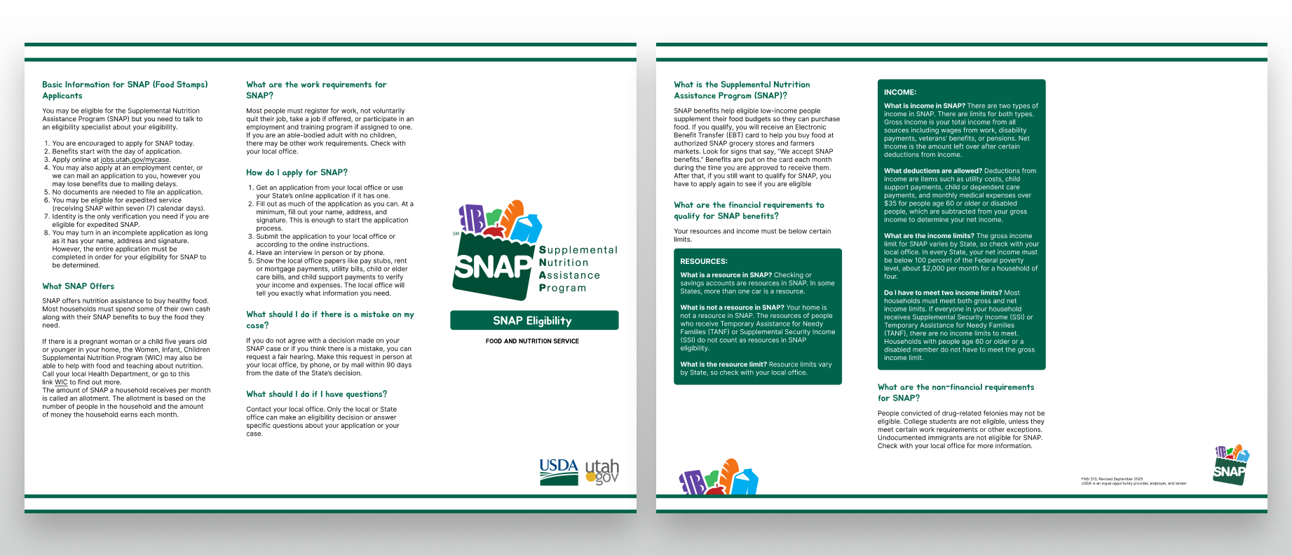
Designing this brochure taught me that information display is both finite and intentional. Every piece of content must be placed thoughtfully, with a clear understanding of how the brochure will be folded and viewed. I learned that the physical folding process is just as important as the design itself—testing the folds ensures that the information flows naturally and remains easy to read. I’m proud of the final result: a design that looks clean, professional, and ready to print.