Design +Case Study
AutoSew Software
Stitch with Ease, Let Automation Please!

Objective
This software was designed in the '90s, and I've reimagined what it could look like with some new features. For context, this software was created to automate the sewing and quilting process for various machines. The objective was to develop a design that is not only simple but also user-friendly for individuals across the spectrum of expertise. We achieved this with a step-by-step system, something that was not integrated into the original product.
Services
UX Design Research
Branding
UI Design
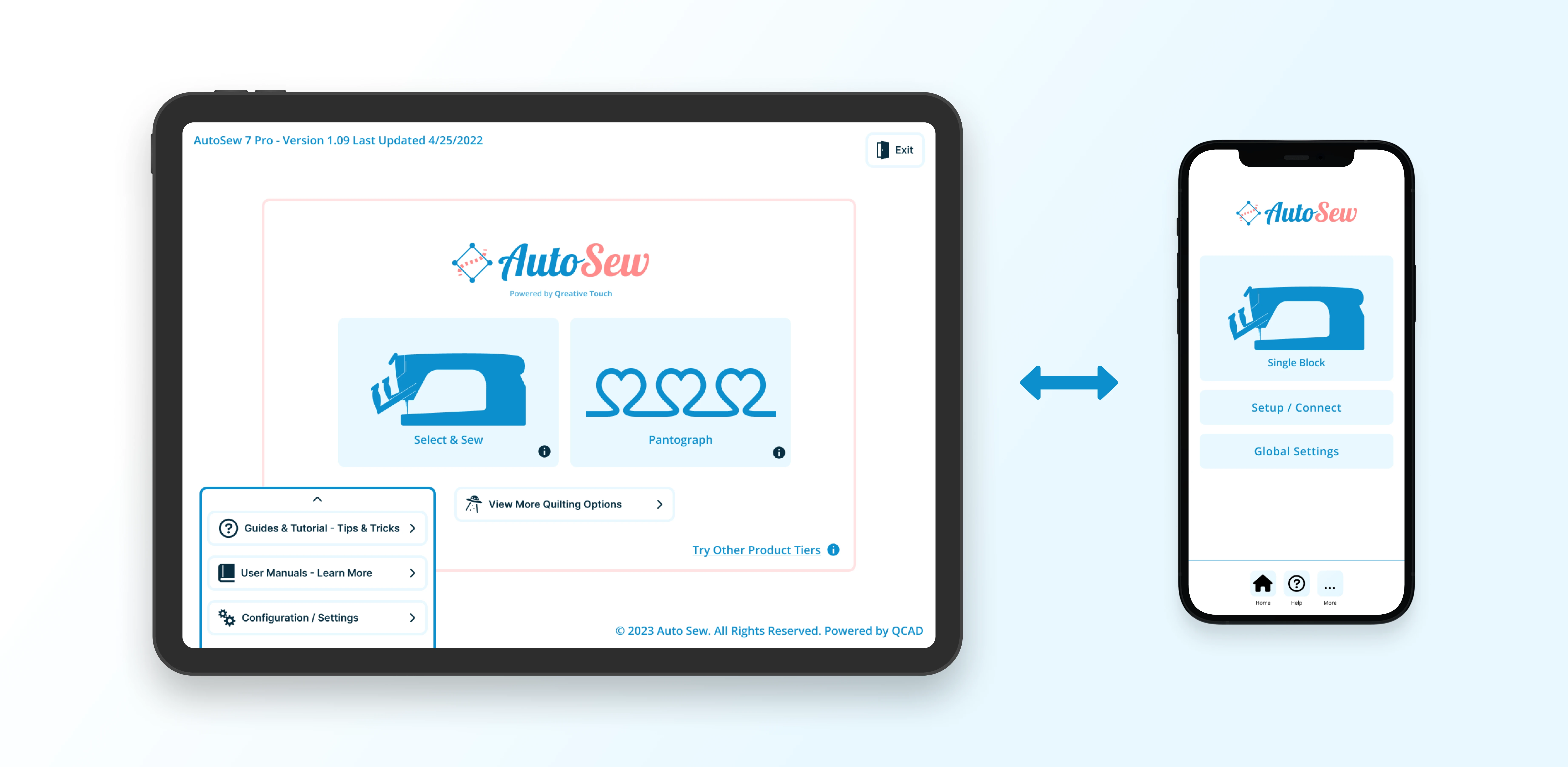
Adapting UI Harmony Between Tablet and Mobile
During the design and brainstorming process, there was consideration of a mobile option replacing the tablet in the future. However, that idea was later scrapped. Despite this, I found enjoyable and innovative ways to optimize the UI, ensuring that both the tablet and mobile versions functioned seamlessly in a consistent manner.
The Simple & Easy - 3 Step System!
Originally, there was going to be a quilting wizard that spoke to the user on the left side of the screen, guiding everyone through the user-friendly software. After extensive consideration and UX research, we discovered that the best option was to isolate each feature into steps. Once the user has chosen a step, they would proceed to the next one. This approach was quite ingenious because it allowed us to get someone started in three easy steps without the need for extensive teaching.
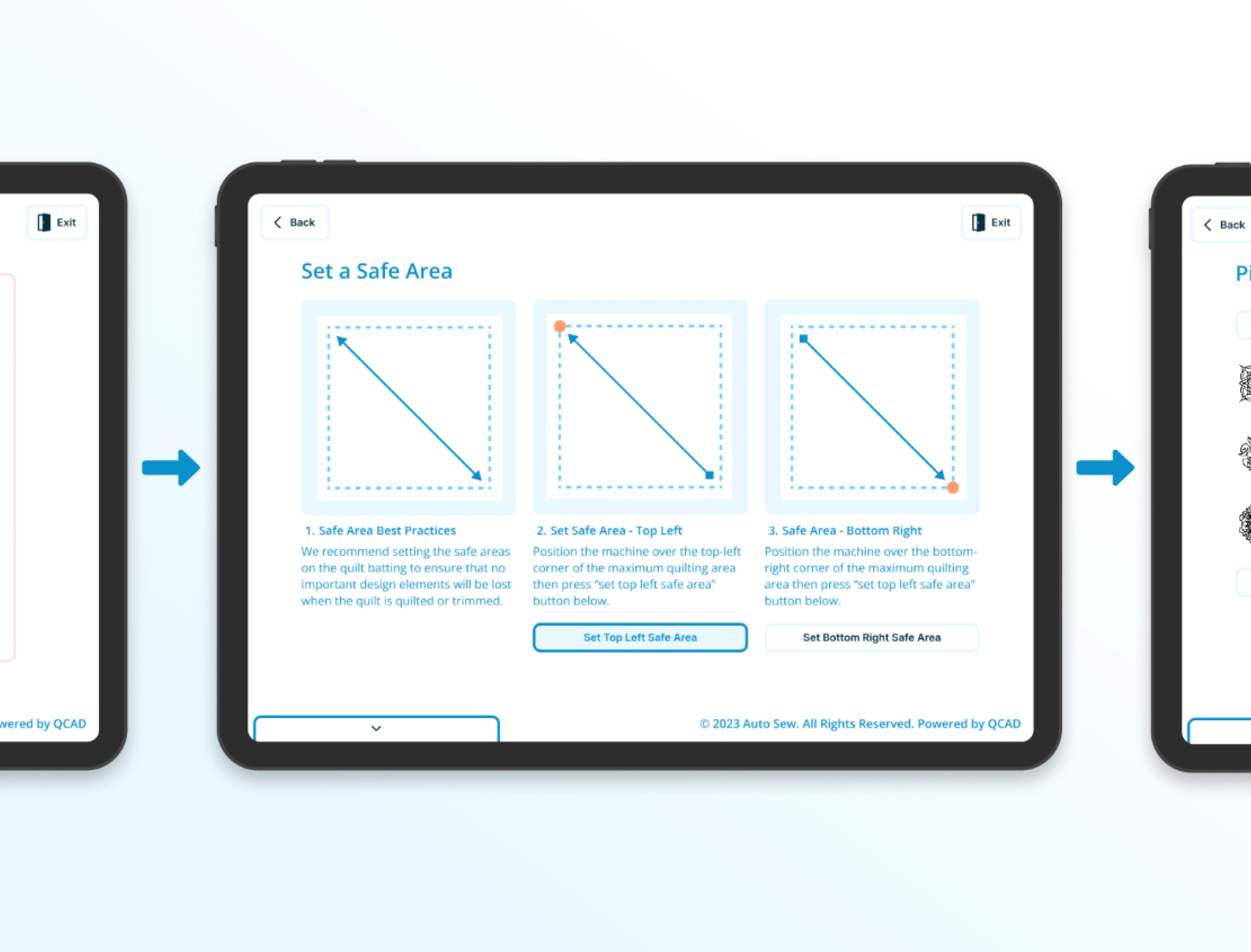
This image is a prototype showcasing the 'Set Safe Zone' feature.
1. Set Safe Zone
The safe zone was the first step; it was the crucial prerequisite before anything could happen with the software, as the machine needs to know where to go. Of course, there were some questions about the naming, such as whether 'quilt area' was more viable because it was more literal. However, we kept 'safe zone' due to its connection with previous users and their association with the product.
2. Pick a Pattern
In the original software, all features were accessible from the home screen, and interestingly, this remains true. However, through UX research, we discovered that placing the pattern picker as the second step was more practical. It turned out to be the initial action users took when getting on the machine. Of course, the safe zone came first, ensuring the machine knows where to commence quilting or sewing.
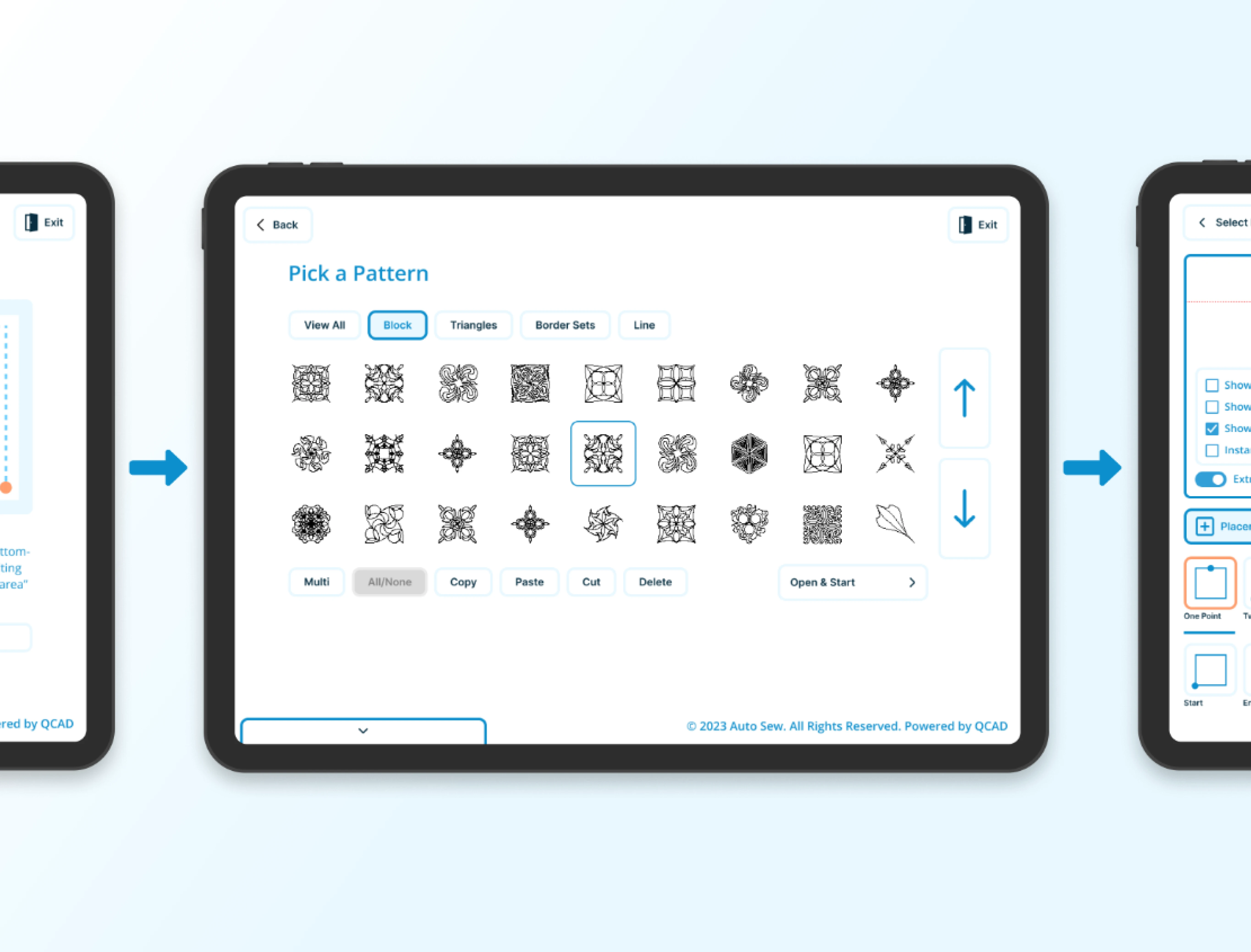
This image presents a prototype highlighting the 'Pick a Pattern' feature.

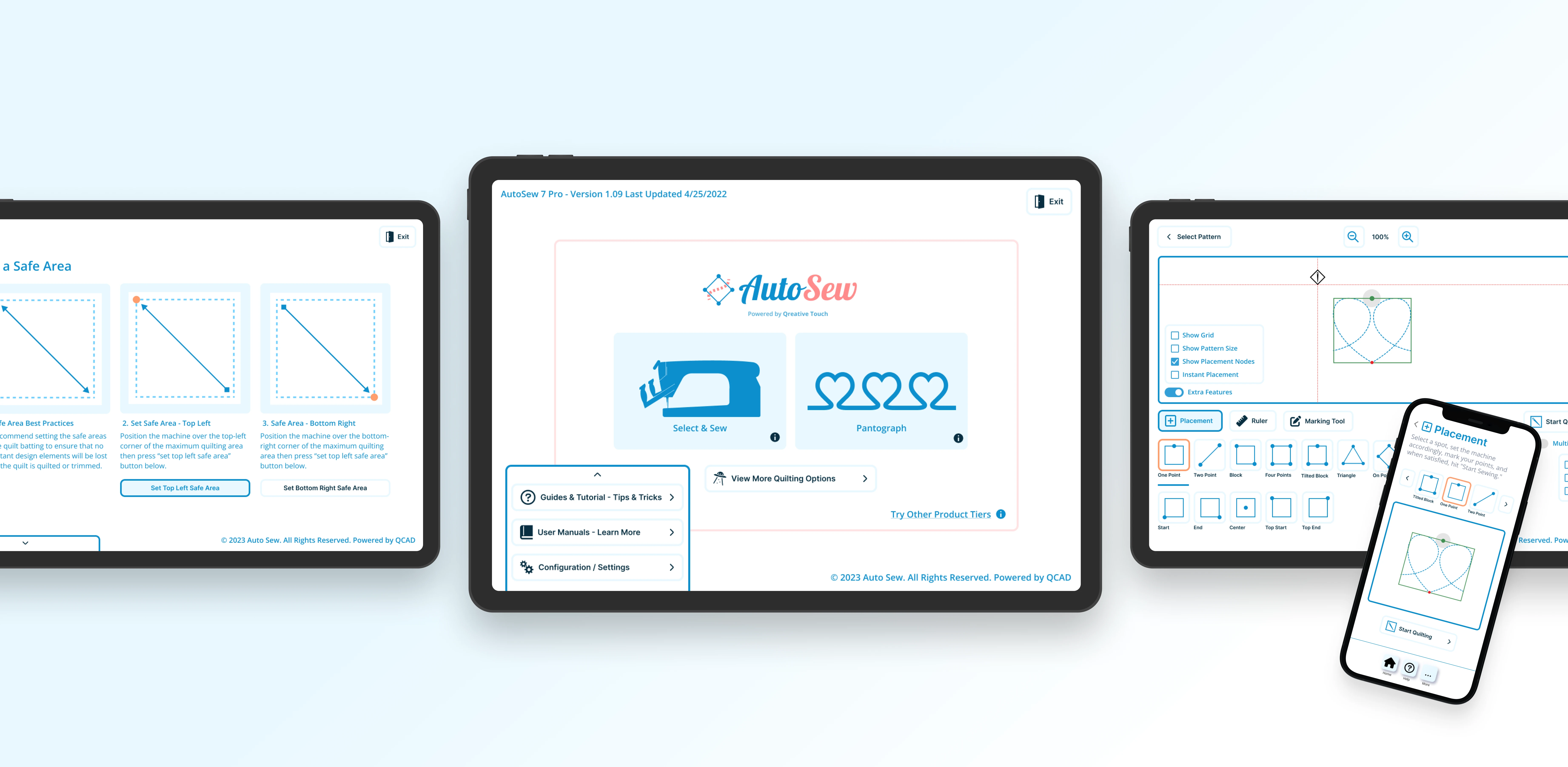
This image is a prototype showcasing the 'Placement' feature.
3. Placement
The third step was placement, users were provided with a comprehensive set of tools, including a ruler and marking tool. I incorporated numerous images to enhance clarity regarding the functionality of each tool. This phase was the final step before letting the machine run on it own. The steps were kept simple enough for users to follow intuitively and we found that user just press “Start Quilting” when they follow the steps on there own.
Takeaway
One of the most significant lessons I've gained is that in UX design and product design at large, a multitude of ideas circulate. Testing these theories I've learned the importance of rigorously testing in order to create the best possible product. I've come to realize that creating a digital product involves numerous steps, and flexibility is crucial for crafting great digital products.